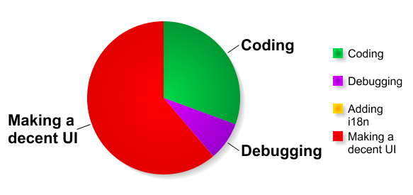
… where "making an UI" means coding the plugin option page, making it understandable, carefully pick some wording, don't overwhelm with unneeded explanations but make sure everything is crystal clear, throw a bit of jQuery to make the page more functional.
… and sometimes I'm a bit fed up with this pattern. Note that it's probably because I lack UI design skills.
NB: If you found this post title to be deceivingly catchy and overselling, you're right.
Shorter URL
Want to share or tweet this post? Please use this short URL: http://ozh.in/tm


You forgot the big chunk of coding that should be labled "Error Checking". This is usually a significant percentage. Though, some of that can overlap into UI, as well.
So true about the i18n – I'm so guilty of this ;)
Jeff Starr » Heh :) Personally I skip the i18n step because that would add another 60% of boredom to the process :Þ
I generally spend about 80% on coding and debugging. Since I learned the Settings API and going for the "attempt to have no options" approach, I find I save a ton of time there.