 Let Adii self introduce him: "I'm a freelance web designer & strategist from Cape Town, South Africa and I specialize in WordPress designs. I'm currently finishing my Honours in Business Strategy and I would love to combine traditional business models with the new principles and philosophies of Web 2.0."
When Adii asked me to review his site, I was pretty excited about it, since after a few minutes discovering his site, I knew I would enjoy writing about it.
His site, first impressions
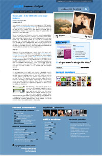
 Adii's custom theme is named "Polaroid", and the name is pretty obvious at first glance: the thing that I noticed first was a Polaroid picture of him and his girlfriend. When too many sites on the intarweb are completely impersonal and you almost have the feeling they're run by robots, I thought this gave a very personal touch to his site. Before I even started reading the site, I had the feeling this man was going to share a bit of his sense for life, love and happiness, and I wanted to know more about him.
Ok, I admit I didn't like the second thing that I noticed: the diagonal stripe pattern in the header. To me, it looked like it's coming from one of those "Make your own Web 2.0 site" generator where you effortlessly make stripes pattern and logos with reflection. There are some stripe patterns I do like, and there's no anti-stripe principle with me, but I didn't like Adii's one. I blame the color choice and the lack of subtelties to my eye, but again, that's a very personal choice.
Adii's theme has a modern 2-column style : a rather wide sidebar featuring few and key elements, uncluttered with the various yet less useful information you often find there (latest comments, latest posts, and so on). All these are relegated down to the footer, which has a very nice CRAP looking. Errr, 'scuse me, did you say CRAP? Yes I did, but I meant "Contrast Repetition Alignment Proximity". CRAP is a design concept I really like and believe in, which I was introduced to a year and a half ago via Think Vitamin, and that I never really managed to apply to my own designs :Þ Back to Adii's footer: it's clear, clean and efficient, I like the use of the very fat bold titles, and in a glance you get a grasp of the site's activity and what it is about. Of course, being the biased WordPress fanboy I am, the "Archive" column showing off 30+ WordPress related entries immediately tickled my eyes.
Overall, I like Adii's blog design. Main content lays on a clean black on white area that's well readable. The footer is in my opinion the best part of his WordPress custom theme, it's solid and chunky.
I noticed three easy improvements Adii can implement to his site:
- A favicon! His previous design (hey, love the orange tapes!) used to have one, this must be one of those "oops I forgot" things.
- A real 404 page. At the moment, 404 pages and the front page are totally similar to a human eye.
- A "Sorry, your search returned 0 result" message, instead of a rather empty page
Site content
Enough of my 2 cents design analysis, let's drill Adii's content now. What is to be read over there ?
 The best part of Adii's site, and definitely the reason you'll visit it and add his RSS to your feed reader, is a growing series of what Adii calls his "mini interviews". The name really does no justice to them: they're not "mini", neither by length nor by quality. Adii managed to interview a variety of people for a number of interviews focused mainly on blogging and web design (with sometimes a WordPress influence, of course).
The reason why I like these interviews is that Adii's goal seems to be both interviewing major personalities in our little world, as well as least known people who surely deserve some exposure.
The "A List" interviews surely does give Adii some authority on the interviewosphere, with very famous names, and I mean it. My favorites :
- Seth Godin, talking about connections between blogs and books
- Chris Garret on the blogging business
- Roger Johansson from 456 Berea Street! On design as a freelancer (and on why Roger doesn't use WordPress:)
You'll also find words from our very own WordPress' Matthew "Photomatt" Mullenweg, SEO fame Graywolf, blogging star Lorelle, and design monster Jonathan Snook.
The lesser known side of his interviews introduce quality people you probably don't know, or at least people I didn't know. My short list here would be:
- The Potato, since I recently stumbled upon his site and really liked it
- Cyan & Collin from Freelance Switch, on becoming a freelancer
- Rockin Themes on selling WordPress themes
… and practically all the interviews that introduced me to WordPress bloggers I didn't know about.
Hey Adii, while I'm here, here are a few people and topics I'd like to read about, hope you don't mind the suggestions :) Say… Darren Rowse from Problogger on managing several blogs, Patrick Gavin on monetizing content, Skippy on developping a blogging platform, Stu Nicholls on being the most amazing CSS wizard on earth. OK? :)
As a freelancer, Adii also blogs about his entrepreneurial experiences, sharing mistakes and successes. A post I particularly liked was Discounting Old Clients, about the difficulty to quote old clients for new jobs, those who were charged much less at that time and that you cannot easily charge more as your skills improve. Another post that's pretty interesting to me is "Experience the Growth", where Adii shares his thoughts and experience about pricing a WordPress theme.
A WordPress designer
You probably figured out by now, Adii wants to specialize his freelance designer activities in WordPress, and has already released several WordPress themes. You can check his portfolio where he shows designs for sale as well as commissioned work for clients.
His custom designs for sale range from clean & magazine looking to personal blog style (the "Beige Blogger" theme looks killer) The point of buying one of his custom designs is that you have the insurance that no other site will ever look like yours, since Adii sells them once and only once.
Design for clients feature really impressive pieces of work, and I'm always thrilled when seeing WordPress sites that really don't look like WordPress sites. Check out the very pro looking Thy Grace Marketing or the heavily graphic Singapore Alive, they're well worth a click.
All in all
All in all, I enjoyed reviewing Adii's site because it's just quality stuff. Great content for the mind served with a nice site for the eyes, what more would you ask for?
I wish Adii all the best for his freelance activities, and I wish all of us some more interesting interviews to read:)
Shorter URL
Want to share or tweet this post? Please use this short URL: http://ozh.in/fe


Hey Ozh! That's absolutely awesome – thank you so much for the compliments and constructive crit (which I'll most definitely keep in mind!). Top notch review from a top notch personality – how about a "mini" interview?
I think that's a pretty sweet layout he's got there. I love the interview section.